Review: Turn Your Art/Photography into Profitable Greeting Cards Online

I’m new to the POD art world, learning my way around the various e-commerce systems for selling digital versions of my art. I am only just beginning to see greeting cards as a possible product.

If you have art to sell and need a low-cost, entry-level product, consider learning about the POD options available to you today in greeting cards.

Reading Stephanie’s book was a very useful, cost-effective introduction to marketplace sites for greeting cards, as opposed to stand-alone e-commerce platforms (Cafe Press vs. Shopify, for example). I came away with a lot of ideas for what to do next and am completely satisfied with the cost-per-idea / encouragement ratio.

This book is a perfect match for Kindle–instant; brief, inspiration to be consumed during a road trip where I wouldn’t have internet access.

(Four not five because it is not a life-changing book; four not three because it is a perfect answer to the problem it proposes to solve.)
Turn Your Art into Profitable Greeting Cards

Use More Pictures in Linkedin

In the process of building a course called “Have Fun with Linkedin,” I realized that LI lets you add pictures everywhere:  summary, each position, projects.  Few of us use this feature as much as we could.

In one class I taught, students even questioned the value of a professional photographer uploading pictures of his work.  Surely he could simply TELL people to visit his website, they asked?

Do they not teach “a picture is worth 1000 words” in school anymore?  We are FAR more likely to visit a photographer’s website when we see what his work looks like, then when he tells us we should visit the website to see what the work looks like.

The older your audience, the more pictures you need.  (Our eyes don’t like that tiny text anymore.)

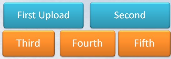
Each entry in your profile (Summary, position) will display at least five images, in the order 2-up, 3-below.  These are landscape orientations.  Select your images accordingly.  If you are going to upload one image, upload two and fill the row.  If you are going to use 3, use 5, and display two complete rows.

Order of upload for Linkedin images or rich media.

Order of upload for Linkedin images or rich media.

You can upload more than five images; subsequent rows are hidden behind a <more> link. You can drag and drop images to rearrange them after uploading.

Select images that display some element of the intersection between who you are and what you do.  Slide presentations can be excellent.  Linkedin will display the title slide, and that can be less-than-interesting.  If there’s a more interesting single slide deep in the deck, save it as a single slide file, and upload that.  Add a short explanation.

Some people may want to show detailed work samples with their rich media attachments.  Other people are using the rich media space to illustrate what they do and how they approach their work.

Face it, most jobs are pretty dull, when described in the words HR makes you use.  It can be hard to read that tiny text and understand how your work is any different from the guy in the next cubicle, let alone from the guy who works in the same position for a different company on the next floor of your building.

Use pictures.

Need ideas?

  • The logo at the front of your building, street entrance.
  • An interesting graph you created from data that matters in your work.  Blur the captions if the data is confidential.
  • A picture of you presenting at a meeting, or a conference.

Because my own work involves so many presentations, I use single slides the most. If you want to know more about the presentation, I’ll be happy to meet with you and discuss developing custom training.

In the old days, slides looked like this, and we read them to the audience, who, apparently, got jobs in Fortune500 companies without being able to read.

Old slide imagery: NOT!

Old slide imagery: NOT!

Now, I get to make slides that look like this (my own images, by the way, NOT stock), and presentations are a whole lot more fun.

Today's slide imagery.

Today’s slide imagery.

The point of images to to help the human evaluate the profile that the machine served up as an answer to a text search.  Use them!

No wonder I hate stock

When I teach the Images unit of the Social Media Marketing Certificate Program, I encourage people to build their own library of stock images. I hate pictures of people writing backwards on glass windows; of perfectly balanced teams where everyone is dressed in color-coordinated clothes, where everyone had an orthodontist.

“Take your own,” I tell them. It’s cheaper, and more authentic. You’ll know what you have, and the pictures will be correct for your location, and … sigh. So many reasons. Some people are persuaded, and for some, it’s simply too much.

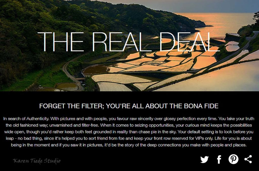
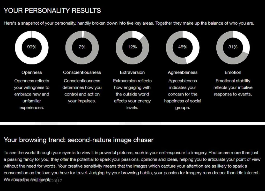
Today, I opened an email from Getty Images. I had a moment to take their Visual DNA test. It’s fun. And I laugh at the results.

Watermark added by my photo processing routine; the images and text are all copyright to Getty Images.

No wonder I hate most stock images. At least the ones where everyone has perfect teeth.

No wonder I hate most stock images. At least the ones where everyone has perfect teeth.

The test was much more interesting than I expected it to be. Had to stop and think for a while about some of the options.

This should not be a surprise.

This should not be a surprise.

I also want to go back through the test and look at some of the arrays. Interesting set ups that make for great photo assignment suggestions. (Think Linkedin Post images, for starters.)

All manner of creative directions: I like that.

All manner of creative directions: I like that.

Yup. Way more creativity than I have figured out how to sell thus far.

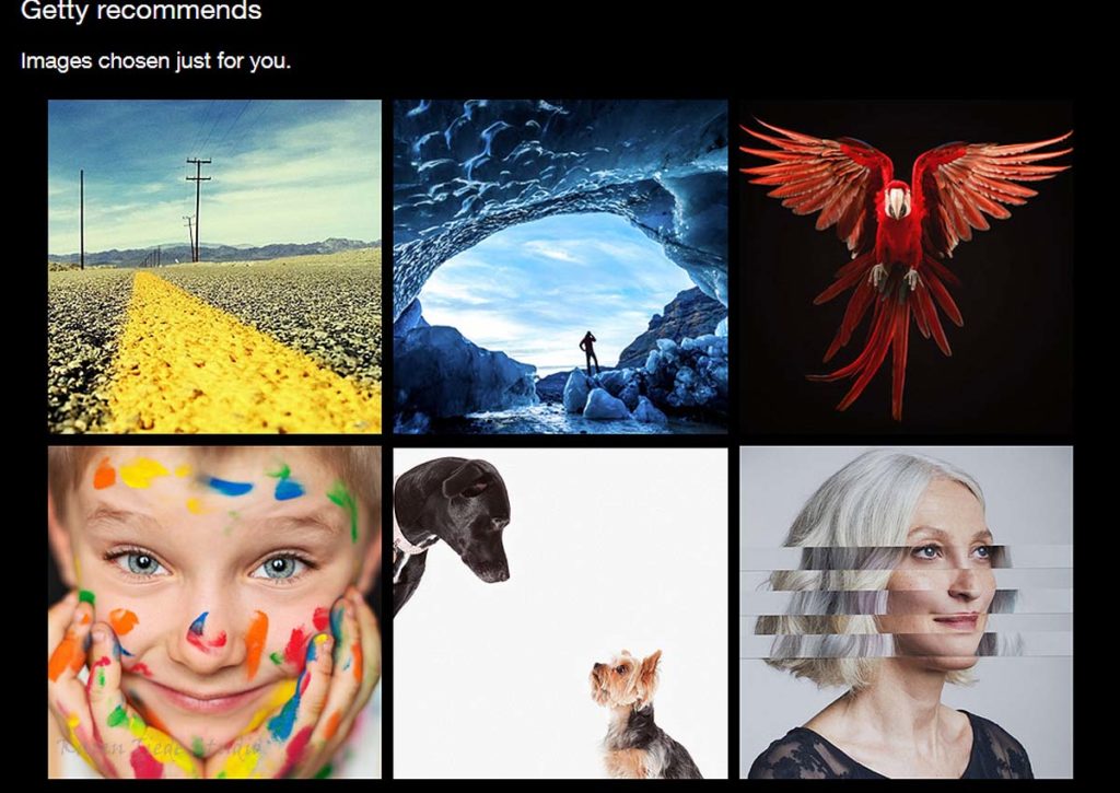
Suggested images from Getty. The dogs are Amanda Jones; love the parrot.

Suggested images from Getty. The dogs are Amanda Jones; love the parrot.

I suppose it’s telling that I recognize at least one photographer in this test.

Save

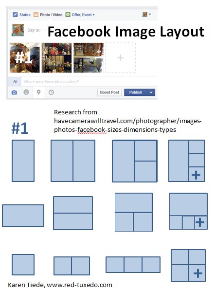
Facebook Image Layouts

A client asked me about how Facebook decided how to display images in posts. Sometimes it worked right, and sometimes it didn’t. I had noticed the same thing, but I’m selling products, not running for office, and getting a politician’s pictures displayed correctly is more important.

A little bit of research led to Daniel Coleman’s post, Facebook Photos Size Guide / 2015.

In shorthand, here’s the same information:

Layout defaults for images attached to Facebook posts: It's all in the aspect ratio of the first image selected.

Layout defaults for images attached to Facebook posts: It’s all in the aspect ratio of the first image selected.

The #1 image is the one at the left. You can drag and drop images around in a post draft to make sure the one on the left has the aspect ratio that will create the layout that best suits your images.

Another solution is to use an app like Layout from Instagram. Layout lets you arrange your images in a selection of formats, then saves the completed unit as one image. Upload that to Instagram or Facebook (or Twitter, or Linkedin, from the gallery) and you don’t have to worry about the arrangement of your images shifting.

Picassa can do a similar thing, in its Collage feature.

The story behind Instagram

The June 2013 issue of Vanity Fair included a story about the start up and sale of Instagram, The Money Shot, by Kara Swisher, pages 76-82.  If you like business stories, read the whole thing.  Instagram was created by Kevin Systrom and Mike Kreiger, and sold to Facebook for $1B. If you simply don’t understand Instagram, here are the two turning points that answered my question about why people use it:

“Instead of doing a check in that has an optional photo, why don’t we do a photo that has an optional check in?”

and

On a beach walk one day, Nicole (GF) told him (Systrom) that she would be reluctant to use the app he was working on because her pictures would never be as good as the ones a mutual friend took.  I (Systrom) said, “Well, you know what he does to those photos, right?”  She’s like, “no, he just takes good photos.”  I’m like, “No, no, he puts them through filter apps.”  She’s like, “well, you guys should probably have filters too, right, then?”  I was like, “Huh.”

Vertical Pins: How Embarrassing

Everyone says, “make tall pins.”  I say it in class.  I show examples of tall pins when I teach.

I wrote a post about creating “before and after” pins that stack vertically because they are more visible than side-by-side images (which look better in a blog post).

I repinned rugs for exposure.

I got traffic.

I wasn’t happy with how my “Rag Rugs, Hand Made in America” board looked, but it was my work and it was colorful.

And one day, I realized that I could rotate most of my rugs 90 degrees and make tall pins.

OMG.  I am embarrassed.

Red Rag Rug pins, showing the difference between horizontal and vertical image alignment.

Red Rag Rug pins, showing the difference between horizontal and vertical image alignment.

The longer the rug, the worse it looked before the rotation, and the better it looked after. Seascape was so bad before I removed all of its horizontal pins across my account before I thought to write this post.

The round rugs will take a slightly different approach. I haven’t finished processing and uploading them.

Here’s another example of the difference between vertical pins and horizontal pins of the same images:

Gold rug pins, showing the difference between vertical and horizontal image alignment, and cropping a round rug to fill the space.

Gold rug pins, showing the difference between vertical and horizontal image alignment, and cropping a round rug to fill the space.

In this set, I have zoomed in on Red and Gold Spiral and cropped it to a rectangular shape so it fills more of the image space. Will probably do this will all of the spirals; not sure about the triskeles (triple spirals).

I will be deleting the horizontal pins over the next few days.  By the time you read this, the boards will all look different and only the screen shots will document my lesson learned.

How to Backup Pinterest Business Boards

If you have important business content on your Pinterest boards, create a backup file of your pins for your own reference and peace-of-mind. Making a backup copy of your business boards protects you from someone hacking into your business account and deleting content.

Another reason to print your boards is so you can cross-check board content against an inventory list. Verify that you have pinned everything you want people to know about.

The current best / easiest way to save your pins is to create a PDF of each board.

First, install a “Print to PDF” driver for your printer, if you don’t have one installed already. (Search on “free PDF converter” and follow the instructions.)

Display the board. Make sure all your pins have loaded and are visible in the browser window. (Scroll down to make sure you don’t see a “loading pins” message.) Schedule backups in the middle of the day, when fewer people are pinning and the Pinterest servers are not as busy as they are before and after work hours.

Next, Select Print from your browser window, and under Print options, select Print to PDF.

Print to PDF Option in printer window.

Print to PDF Option in printer window.


Select OK and wait. You will see a pop-up window asking for the name of this file. Name the file with the board name. Add the account name if you have more than one Pinterest account. Some people include the date in the file name and some people let the file metadata provide the date.

File name printer window

File name printer window

Because I am backing up two Pinterest accounts to the same directory, I add account name prefixes so I can sort the backup files easily. I could also save the files into different directories.

If you need to crosscheck against an inventory list, printing the board file can make it easier. Some PDF programs allow you to write in the PDF itself.

Humor Stash board backup

Humor Stash board backup, in PDF format

Repeat with your next board.

If your boards have commercial value to your business, you will want to repeat this process at some regular interval, perhaps monthly. Recreating a board from memory is way less fun than creating and loading it the first time around.

(Real world update: Pinterest is not sending ALL of my board content to the print file–only the first page and the last row of pins. I have a request in to several other services, but the output is incomplete on all of them. Pinterest says it is working on a print upgrade.)

How to Make Cover Pins for Your Pinterest Boards

Board “cover pins” are the pins you select to be the largest image on a board in your Pinterest account’s Board View. Setting board covers can help to identify the content of a board.

If you don’t set a board cover image deliberately, the first image you pinned will be displayed as the largest image under “Boards view.” Sometimes, this works, but more often,

Board title + the first image pinned = random = confusion

“Confusion” is not a good state for a Pinterest business account’s visitor. As the owner of a business account, you want to help a visitor understand what each of your boards is about.

Look at how the cover pins on the labelled boards below help explain what the board is about, compared to the boards that don’t have a branded label:

Cover pins from Small for Big

Cover pins from Small for Big

I help my clients create specific board cover pins, with text that provides more information than the board name can provide by itself.

You don’t have to create covers for all your boards. Title the boards that are most important for your business, as well as those on the top two rows of boards, which is your best Pinterest real estate.

Here are three ways to create cover pins for your Pinterest boards:

Use a Photoeditor to Make a Board Cover Pin

  • Use your favorite photo editing program or application.
  • Select your own photo for the background.
  • Add a frame.
  • Fill the inside of the frame with a contrasting color.
  • Add text that describes the contents of the board. Make the text large enough to be clearly visible when visitors view the image on the “board view” display.
  • If your account and/or website have a clear graphic style, make the colors and fonts match your business’ graphics. My art site is brightly colored and I can use different colors for each board and still “fit.” I am use the same font for all of the board labels; the same font I use on the website header and my price tags and other collateral.
Rug Board Cover Pin, created in Photoshop Elements

Rug Board Cover Pin, created in PS/E

  • If you don’t have a strong color sense of your own, select colors from the background image using the eyedropper for the frame and font. This will make a more cohesive board label than selecting random colors.  Both the purple and the green in the frame above were eye-droppered from the image in the background.
  • Save the completed image with text as a jpg.
  • Load it to the correct board using the Upload image feature. After you load this image as a pin, edit the pin to point the URL to a useful page on your website.
  • Set the board cover. Add a few more pins to push the cover image off the front row pins and hide it a bit lower in your collection.

Use PicMonkey online photoediting to create a cover pin if you don’t have Photoshop Elements.

Make a Board Cover Pin with Quozio

If you don’t have a useful image of your own, create a cover pin using Quozio. I don’t own the copyright to the images I pin on my teaching boards, so I can’t modify the images for my own purposes.

For example, I created a pin in Quozio (see Use Quozio to Create Text Pins for instructions) to explain that the pins on the Cancer Care board were examples of what you could pin if you were pinning for a health care practitioner in a specific condition-related field.

Cover Pin for Cancer Care board, created in Quozio

Cover Pin for Cancer Care board, created in Quozio

I allowed the title pin to point back to Quozio. When I write the blog post explaining how readers could create similar boards of their own, I will edit the cover pin to point to that blog post.

The board description also points out that this is an example of possible Pinterest Marketing information for a health care provider, NOT a board about any type of medical care.

I scrolled through the images available at Quozio to find one that was appropriate for a board about cancer.  Not all of the images worked as well as this one.  Quozio doesn’t offer any good “sky” or “cloud” pins. I can’t use Quozio to make a title pin for a flight school.

Select a Pin That Contains Text

Select a pin from the board that clearly explains what the board is about. I did this on the board I use for Accountants and CPAs. I found a pin of a book that teaches accounting. The book cover clearly explains the content of the board. I simply selected this with “set board cover.”

Accounting Board Cover Pin

Accounting Board Cover Pin

When you look at the RedTux Board view, it’s easy to tell what’s on this board.

Labelled vs. unlabelled boards

Mix of labelled and unlabelled boards on the Red Tuxedo Pinterest account.

First Row, Left

From the upper left, you can see that the first two boards are clearly identified. Residential Real Estate needs a better cover, with less overlap at the margins. It’s not at all clear what the three boards on the right are about (pins from the businesses of people who have taken my class) and they all need attention.

Second Row, Left

First board is clear enough; second and third need help. Four on the left are either labelled or clear. The text for the Flying board seemed big enough when I made the pin but it’s harder to read than its neighbors. May increase the size next time.

Third Row, Left

The image for Golf is reasonably clear. “Transferring” is a board I use to move pins between accounts, and is labelled as such. The other boards all need cover pins but may be left as is for teaching purposes.

Use Quozio to Create Text Pins

Quozio is a bookmarklet available from Quozio.com.  Intended to create pinnable quotations with attribution, I use it for much more than quoting other people.

First, install the bookmarklet onto your browser toolbar.  I keep it right next to the PinIt bookmarklet.

Quozio Bookmarklet on my browser toolbar

Quozio bookmarklet on my browser toolbar

When you have something to quote, click on the bookmarklet.

Quozio Pop-up

Quozio pop-up


Type your quotation or text into the large field, and the person who said it into the smaller field.  See the Quozio how-to if you need more information.

Quozio background and font choices

Quozio background choices

Scroll through the background and font choices till you find a combination that works for the message you want to share.  You can probably get close, although I wish they had a few sky-cloud backgrounds.  Don’t use the casual handwriting fonts for serious messages, and be careful about the black backgrounds–they can look very serious.  You’ll know when you get it right.

(Notice that the thumbnail second from the left in the screen shot above is the US Flag.)

Quozio will pin to your open Pinterest account (or most recently-opened) and your most recently pinned to board.  You can change the board on the fly.  Unless you edit the link, the pin will point back to to the Quozio site.  You can open the pin from the “Success” pop-up window and point the link to a page on your own website that fits the text.

I use Quozio when I hear a useful business idea, or when I find a quotation in a book that I want to share.  (Add book and page information to make the pin more useful to other people.)  But those aren’t the only ways to use the tool.

Other Ways to Use Quozio Beside Quotations

  • (Links in these bullets all go to pins and boards within Pinterest.)
  • Create cover pins for your boards—pins that explain what the board is about, better than the board title can do.  (I use Quozio for a board cover when I don’t own m/any of the images on the board itself, esp. for my teaching boards.)
  • Post text-based information, such as an announcement about a class that would interest people looking at the board.  (Be sure to include a year, because calendar-based information gets old fast.)  Point these pins to the website for the class or event.
  • Passing comments on Pinterest itself.  (Why do they keep showing me boards about Vegans when I have never pinned any food-related content at all?)
  • Live pin-journalism, from an on-going event.  I will point these pins either to the speaker’s website, or to the website for the event itself.  (Article about pin-journalism in process as you read.)

If you find Quozio useful, be sure to like them on their FB page!


PinIt Bookmarklet Passes Alt Tag

Inquiring minds want to know:

What image meta tag gets pulled into a pin?

Does it matter which pinning tool you use?

Your personal Pinterest Investigative Reporter to the Rescue.

I tested Pinterest’s PinIt Bookmarklet (first option on the list) on my Rugs from Rags site (better image collection) to see which of an image’s metadata fields was passed to the Description field on a pin.

It’s the Alt Tag.

PinIt Bookmarklet passes Alt tag to pin description.

Test of PinIt Bookmarklet


When you load images to your website that you want other people to pin, make sure you have useful content in the Alt field. Some pinners will delete this and add their own description (often lame, unfortunately) but if you offer good content, you have a better chance of your words making it into the pin flow.

I’m off to review all my alt tags. (Will test other WP plugin pinning options as I come to them. I use NextGen to manage a lot of the images on Rugs from Rags and I don’t like the way any of the Pinterest plugins work with NextGen.)

I’m writing a separate post about using Pinterest’s image-specific PinIt button (third option on the list).

Malcare WordPress Security