In the process of building a course called “Have Fun with Linkedin,” I realized that LI lets you add pictures everywhere: summary, each position, projects. Few of us use this feature as much as we could.
In one class I taught, students even questioned the value of a professional photographer uploading pictures of his work. Surely he could simply TELL people to visit his website, they asked?
Do they not teach “a picture is worth 1000 words” in school anymore? We are FAR more likely to visit a photographer’s website when we see what his work looks like, then when he tells us we should visit the website to see what the work looks like.
The older your audience, the more pictures you need. (Our eyes don’t like that tiny text anymore.)
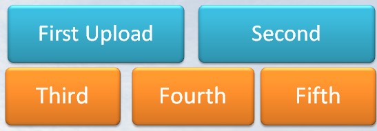
Each entry in your profile (Summary, position) will display at least five images, in the order 2-up, 3-below. These are landscape orientations. Select your images accordingly. If you are going to upload one image, upload two and fill the row. If you are going to use 3, use 5, and display two complete rows.
You can upload more than five images; subsequent rows are hidden behind a <more> link. You can drag and drop images to rearrange them after uploading.
Select images that display some element of the intersection between who you are and what you do. Slide presentations can be excellent. Linkedin will display the title slide, and that can be less-than-interesting. If there’s a more interesting single slide deep in the deck, save it as a single slide file, and upload that. Add a short explanation.
Some people may want to show detailed work samples with their rich media attachments. Other people are using the rich media space to illustrate what they do and how they approach their work.
Face it, most jobs are pretty dull, when described in the words HR makes you use. It can be hard to read that tiny text and understand how your work is any different from the guy in the next cubicle, let alone from the guy who works in the same position for a different company on the next floor of your building.
Use pictures.
Need ideas?
- The logo at the front of your building, street entrance.
- An interesting graph you created from data that matters in your work. Blur the captions if the data is confidential.
- A picture of you presenting at a meeting, or a conference.
Because my own work involves so many presentations, I use single slides the most. If you want to know more about the presentation, I’ll be happy to meet with you and discuss developing custom training.
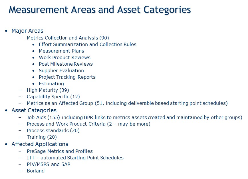
In the old days, slides looked like this, and we read them to the audience, who, apparently, got jobs in Fortune500 companies without being able to read.
Now, I get to make slides that look like this (my own images, by the way, NOT stock), and presentations are a whole lot more fun.
The point of images to to help the human evaluate the profile that the machine served up as an answer to a text search. Use them!


Speak Your Mind