When I teach the Images unit of the Social Media Marketing Certificate Program, I encourage people to build their own library of stock images. I hate pictures of people writing backwards on glass windows; of perfectly balanced teams where everyone is dressed in color-coordinated clothes, where everyone had an orthodontist.
“Take your own,” I tell them. It’s cheaper, and more authentic. You’ll know what you have, and the pictures will be correct for your location, and … sigh. So many reasons. Some people are persuaded, and for some, it’s simply too much.
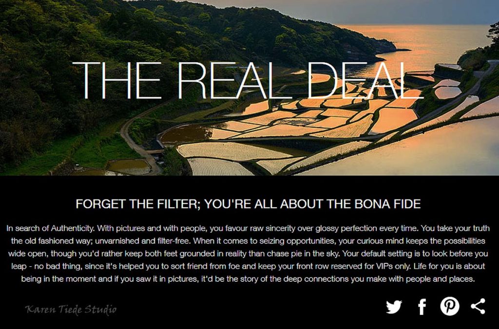
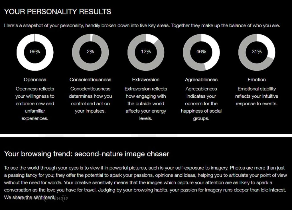
Today, I opened an email from Getty Images. I had a moment to take their Visual DNA test. It’s fun. And I laugh at the results.
Watermark added by my photo processing routine; the images and text are all copyright to Getty Images.

No wonder I hate most stock images. At least the ones where everyone has perfect teeth.
The test was much more interesting than I expected it to be. Had to stop and think for a while about some of the options.

This should not be a surprise.
I also want to go back through the test and look at some of the arrays. Interesting set ups that make for great photo assignment suggestions. (Think Linkedin Post images, for starters.)

All manner of creative directions: I like that.
Yup. Way more creativity than I have figured out how to sell thus far.

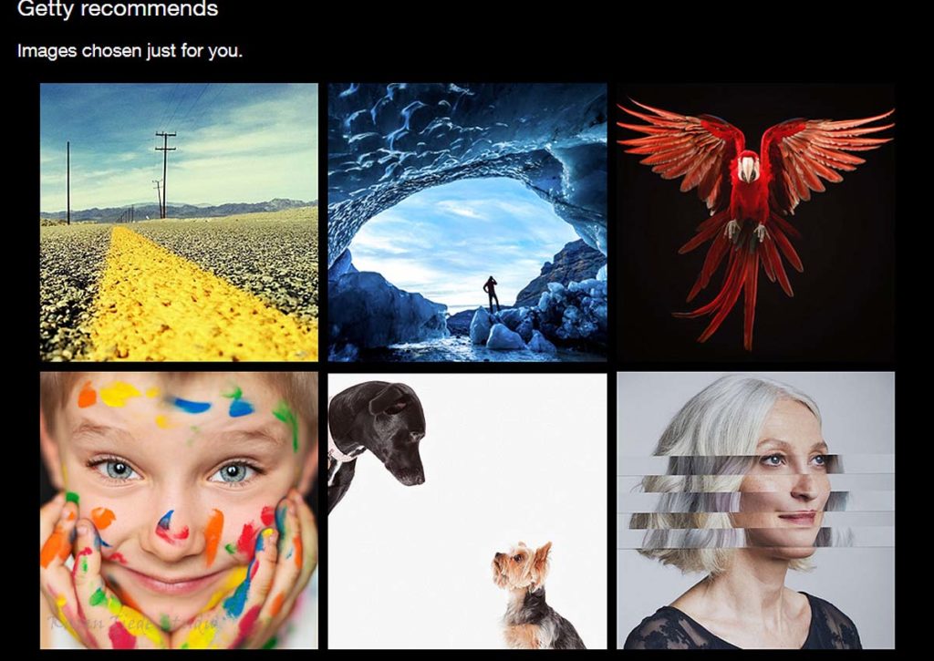
Suggested images from Getty. The dogs are Amanda Jones; love the parrot.
I suppose it’s telling that I recognize at least one photographer in this test.


Speak Your Mind